Sleek with Mobirise Responsive Bootstrap Landing Page Builder Marketing Theme


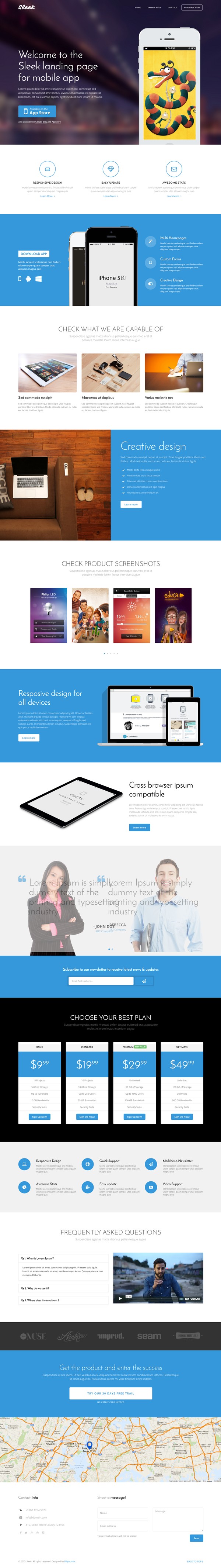
Sleek– A perfect landing page to show off your website to this world. You can use this landing page for all type of products, apps, eBooks, Software’s. Its multipurpose. This template was designed with Responsive design, Bootstrap, HTML5 / CSS3 , Responsive slider, Testimonial Carousel, Working Contact form, Google map and much more.. Also comes with super-easy drag-n-drop builder to speed up the development.
Note: This is NOT WordPress theme, it’s an HTML Landing Page Template with Page Builder.
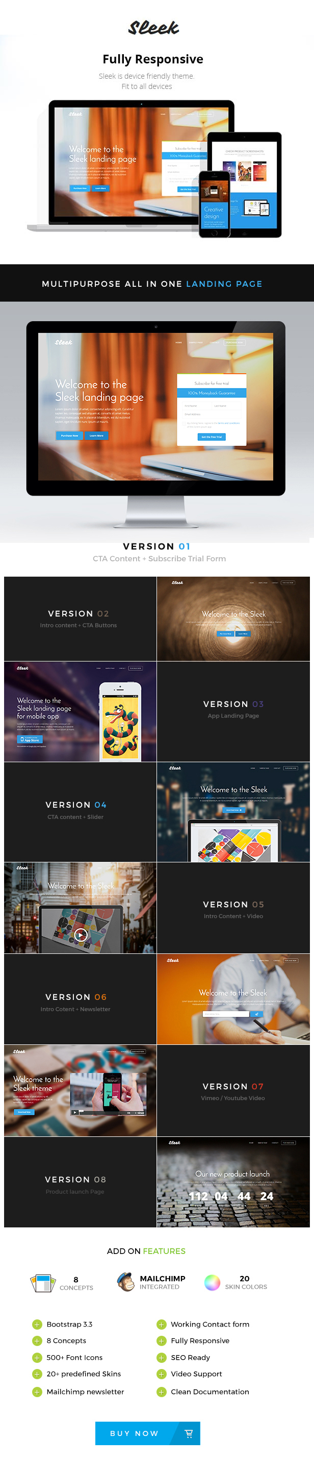
FEATURES
- Responsive design
- HTML5 / CSS3
- Bootstrap 3.3
- 8 Concept Styles
- 20 Predefined Colors
- Responsive slider
- Mailchimp Newsletter
- Testimonial Carousel
- Google Fonts
- Accordion
- Video Support (Vimeo/Youtube)
- Social Icons
- 400+ Fonticons
- Well Documented
- Working Contact form
- No coding knowledge required
- Valid HTML
CHANGELOG
2016, July 22 – Version 1.2
- support for mobirse builder added
2016, April 17 – Version 1.1.1
- some fixes for mobile devices
2015, February 15 – Version 1.1
- Mailchimp Integrated
- New Concept
    - new page added with product launch timer
- Extra
    - Mailchimp form added for all pages. Previously it was available only in 2 pages.
CREDITS
All files and resources I’ve used are located below. A big thanks goes out to those who have made it possible to let us use there resources for commercial purposes.
- Google WebFont used – Josefin Sans
- Google WebFont used – Vampiro One
- Google WebFont used – Open Sans
- Free Website Builder – https://mobirise.com/
- Slider plugin – Bootstrap Carousel
- Gallery plugin – Bootstrap Gallery
- Fonticons by – Line Icon Font
- Demo images from – Free Library
Images in live preview are not included to the template.


If you scroll down slowly, you will see the main title and text overlapping with the top menu and the logo until you go all the way. This looks very awful. It happens with Chrome, I haven’t test it with any other browser. Can this be fixed?
ReplyDeleteUpdate: Sleek team contacted me with a fix in less than 24 hrs. Thank you.
ReplyDeleteI’m trying to make the background image full screen, but so far I haven’t had any sucess. Any ideas?. Thank you.
ReplyDeleteReply sent through mail.
ReplyDeleteJust a nice to have feature in the future, instead of having text as the company/product name (default Sleek), use an image so people can incorporate their logos. Cool template.
ReplyDeleteIn next update, will update the text to image.
ReplyDeleteIf you want that feature now, find this in index.html
<a class="navbar-brand" href="./index.html">Sleek</a>
and replace it with this
<a class="navbar-brand" href="./index.html"><img src="logo_image_source" alt="" /></a>
and finally in the above code update “logo_image_source” with your logo image url or source. It will work.
Thanks.
Yes I tried that, the problem is the top nav bar, the logo doesn’t fit correctly. I guess when changing to the fixed nav bar, the main logo could dissapear and a smaller version of it reapear withing the nav bar. That could give us also the chance to use a different color for the smaller logo in contrast with the nav bar. Thank you.
ReplyDeleteyes. If your logo is big, you must use this
ReplyDelete<a class="navbar-brand" href="./index.html"><img src="logo_image_source" style="max-width:150px" alt="" /></a>
Here change the 150px to more or less to increase or decrease the image size.
For any more support. Send a mail from this page.
ReplyDeletehttp://themeforest.net/item/sleek-responsive-bootstrap-3-landing-page-/10401550/support
Thanks
I ended up adding the following. Not sure if that’s the correct way to do it, but at least it does what I need. If this feature is implemented in the future, let me know. Thanks.
ReplyDelete// Fixed Header
$(window).scroll(function() {
var value = $(this).scrollTop();
if (value > 100)
{
document.getElementById(“small-logo”).style.visibility = “visible”;
document.getElementById(“big-logo”).style.visibility = “hidden”;
$(“header”).css(“background”, ”#FFFFFF”).css(“padding”, “0px 0px 13px”);
}
else
{
document.getElementById(“small-logo”).style.visibility = “hidden”;
document.getElementById(“big-logo”).style.visibility = “visible”;
$(“header”).css(“background”, “transparent”).css(“padding”, “20px 0px 20px”);
}
});
and added two images to index for small and big logos
<!- /END ONLY LOGO ON HEADER ->
Hi. Thanks for the feedback. Will add this feature in next update.
ReplyDeleteHi! Is it possible to add 2 new inputs in the contact form: a phone number and city? Thanks a lot
ReplyDeleteHi,
ReplyDeleteYes. Pls send mail through my profile. Will reply back with the updated file.
http://themeforest.net/user/dilipkumar
Hi.
ReplyDeleteWe are experiencing a mobile view problem on our landing page with this theme. The background picture isn’t showing up when we view the page using our iPhone5 and iPhone6.
Here is link for the screenshot of our landing page: http://screencast.com/t/ARa75cIDaV
Here is the link of the screenshot on your demo: http://screencast.com/t/18wLB7Wbn
And here is the link of our landing page: http://webital.com/renvision-sleek/roofing-replacement.html
Looking forward for your reply.
I am happy to help. But pls send a mail through my profile page, so it will be easy to reply back with the fix.
ReplyDeleteThanks
I tried to add the theme and it gave me this message:
ReplyDeleteInstalling Theme from uploaded file: themeforest-10401550-sleek-responsive-bootstrap-3-landing-page-.zip
Unpacking the package…
Installing the theme…
The package could not be installed. The theme is missing the style.css stylesheet.
Theme install failed.
.
NORMAL MENU like in MOBIRISE!!!!
ReplyDeleteWhen will be Update?????
hi
ReplyDeletedoes it work with Mobirise?
Yes, it does work with Mobirise Page Builder, see https://theme.express/sleek/builder/
ReplyDeleteThe MENU is visible all of the time and not folding menu like now or possibility to change it.
ReplyDeleteARTICLE BLOCK – there isn’t the possibility of maneuvering on the top and bottom padding.
ReplyDelete“Make your own website in a few clicks!”
“Lorem ipsum dolor sit amet, consectetur adipisicing elit. Odio a atque hic architecto nostrum!”
ARTICLE BLOCK – there is not the parameter blocks to manage the various options (padding, etc … etc)
ReplyDelete“Make your own website in a few clicks! Mobirise helps you cut down development time by providing you with a flexible website editor with a drag and drop interface. MobiRise Website Builder creates responsive, retina and mobile friendly websites in a few clicks. Mobirise is one of the easiest website development tools available today. It also gives you the freedom to develop as many websites as you like given the fact that it is a desktop app.”
If you scroll down slowly, you will see the main title and text overlapping with the top menu and the logo until you go all the way. This looks very awful. It happens with Chrome, I haven’t test it with any other browser. Can this be fixed?
ReplyDeleteAnother thing: How to fix navbar visible on the top always?
ReplyDeleteHi. In your beautifull landing page builder, I can use a logo image positioned in the middle to top on the page? And it’s possible to use a background image slider? Thanks a lot. Best regards, Bruno
ReplyDeletehello, your builder seems to be good but how can we try it ?
ReplyDeletePlease download the free version from https://mobirise.com/
ReplyDelete